The dawn of a new Premier League season brings fresh hope on the pitch and fresh threads in the kitbag. At Baji, we’re breaking down every design detail, historical reference, and stylistic choice that makes this season’s kits stand out. From retro revivals to bold graphic statements, here’s your comprehensive guide to the Premier League’s sartorial offerings for the 2024/25 campaign.
Arsenal: Classic Elegance Meets Modern Flair
Arsenal’s home kit features the striking addition of a collar and new lightning bolt accents, creating a perfect blend of tradition and innovation. The Gunners debuted this iconic look in their final Premier League match of last season, giving fans an early glimpse of things to come.
What makes this season particularly special is the charitable component: five pounds from every shirt sale goes directly to the Arsenal Foundation, supporting local community initiatives. This commitment to social responsibility sets a powerful precedent in football merchandising.
The away strip presents a dramatic departure with an all-black design that pays tribute to the club’s global fanbase. Bronze accents on the adidas logo and Emirates branding create a sophisticated contrast, while the three metallic stripes on the sleeves add a touch of luxury.
Perhaps most surprising is the third kit, which marks the first pink shirt in the club’s history. Featuring the iconic Ermine pattern from the late 1940s crest printed throughout, it represents both a nod to history and a bold step forward in design philosophy.
Manchester City: Honoring Legends Through Design
Manchester City’s home kit features a special tribute to legendary figures in the club’s history, with the badge moved to the center in homage to the 1967/68 title-winning kit worn by Colin Bell. The sky blue PUMA strip with maroon trim perfectly captures the essence of City’s golden era.
Fans can personalize their shirts with the names of legendary figures Bell, Francis Lee, and Mike Summerbee, creating a tangible connection between the club’s storied past and its exciting present. This approach to kit design demonstrates how clubs can honor their history while looking toward the future.
The away kit draws inspiration from the class of 1969, featuring the vertical red and black stripes that proved triumphant in multiple cup finals under Malcolm Allison. This thoughtful retro design resonates with longtime supporters while appealing to new generations of fans.
Liverpool: Emotional Tributes and Musical Inspiration
Liverpool’s home kit embodies the spirit of ‘Scouse solidarity’ with a bold, no-nonsense design that reflects the mentality of its people. The intricate YNWA detailing on the sleeve cuff represents the unbreakable bond between fans and club, while the 97 emblem at the nape honors those who lost their lives in the Hillsborough tragedy.
The away kit presents perhaps the most daring design of the season, featuring a dizzying iridescent pattern inspired by Liverpool’s pioneering role in the 90s dance music scene. This innovative approach to kit design demonstrates how clubs can celebrate their cultural heritage beyond football.
According to football fashion expert James Wilkinson, “Liverpool’s kits this season perfectly balance respect for tradition with willingness to innovate. The musical inspiration for the away kit is particularly clever, connecting the club to the city’s broader cultural significance.”
Chelsea: Historical Homage and Modern Uncertainty
Chelsea’s new kit pays homage to Ted Drake, who joined the club 70 years ago and led the Blues to their first league title in 1955. Drake’s influence extended beyond tactics—he changed the club’s nickname from ‘the Pensioners’ to ‘the Blues’ and introduced the lion image that remains in the badge today.
Interestingly, the promotional video features Cesar Azpilicueta and Christian Pulisic prominently, despite transfer speculation surrounding both players. This creates an intriguing dynamic between kit launches and squad uncertainty that often characterizes the modern football landscape.
Emerging Trends in Premier League Kit Design
Retro Revival Across Multiple Clubs
This season sees a significant trend toward retro-inspired designs, with several clubs drawing inspiration from specific historical periods. Leicester’s home shirt features a prominent white collar and neck trim synonymous with the Jimmy Bloomfield sides of the 1970s, while the ‘dynamic fox’ logo recalls the era of Gary Lineker and Alan Smith in the 1980s.
Similarly, Manchester United’s home shirt features a patterned polo collar that bears resemblance to some of the club’s most memorable kits throughout history. The description explicitly notes this as “a subtle nod to some of our former greats, whose unique style on and off the pitch made their kit their own.”
Bold Graphic Statements
Several clubs have embraced more adventurous designs this season. Crystal Palace’s home kit includes an unusual scribble effect with thick white trim on both the collar and arms, demonstrating how even traditional color schemes can be refreshed with innovative patterns.
Southampton has taken perhaps the boldest approach, moving away from their traditional red and white stripes to feature a single central red stripe and central badge. The club explicitly states that this design is intended to inspire bravery both on and off the pitch.
Environmental Considerations
Environmental consciousness continues to influence kit design, with Everton’s kits produced using the Eco 8 process—each shirt made from eight recycled bottles with minimal water used in the dying process. This supports the club’s Everton for Change environmental campaign and reflects growing consumer demand for sustainable sportswear.
Manchester United has also embraced sustainability, with their away shirts made from 100 percent recycled material featuring helixes woven into the fabric.
Promoted Teams Making Their Mark
Nottingham Forest’s Clean Approach
Nottingham Forest’s home kit presents a unusual sight in modern football: no sponsor logo. This isn’t an intentional minimalist design choice but rather reflects ongoing talks to confirm a main shirt sponsor. The club has assured supporters that once a deal is agreed, the additional logo can be applied in the club shop.
The design itself features subtle nods to Trent Bridge as part of a pattern on either sleeve, creating local connections that resonate with supporters. This approach demonstrates how newly promoted clubs can balance commercial considerations with fan engagement.
Bournemouth’s Modern Twist
Bournemouth’s home kit offers a modern twist on their traditional red and black stripes, drawing inspiration from iconic kits from the early nineties. The zig-zag design of the stripes is reportedly inspired by and reflective of the club’s architectural stadium pillars, creating a unique connection between kit and home ground.
Their third kit has been inspired by the ‘Everyone, Together’ campaign, which tackles prejudice and celebrates diversity around the club. This demonstrates how kits can serve as platforms for social messages beyond mere aesthetics.
Fulham’s Riverside Inspiration
Fulham’s classic white home offering features a special design on the sleeve cuffs and collar that represents the ebb and flow of the River Thames, creating a tangible connection to the club’s geographical identity. The away kit continues this thematic approach with a detailed modern interpretation of the Craven Cottage brickwork across the front of the body.
Controversial Designs and Fan Reactions
Newcastle’s third kit has generated significant discussion, with its white and green colors matching those used in the flag of Saudi Arabia. While not explicitly mentioned by the club, this color choice inevitably draws attention given the club’s ownership structure.
West Ham’s away kit has taken a “keep it simple” approach according to Umbro’s tag line, with a mostly black shirt contrasted with claret, blue and white patterns at the base of both sleeves inspired by East London’s diversity and the club’s origin as Thames Ironworks.
The Business of Kits: Sponsorship and Branding
The Premier League‘s kit landscape reveals interesting developments in sponsorship and branding. Brentford has taken the unusual approach of continuing with the same home kit as their historic maiden Premier League campaign, while their ‘second shirt’ incorporates the castle badge used by the club from the mid-1970s to the early 1990s.
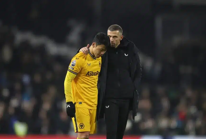
Wolves’ new kit is the first to display their landmark partnership with AstroPay, who feature on the front of shirts alongside new sleeve partner 12Bet. This double sponsorship approach reflects the increasing commercial sophistication in Premier League kit deals.
Aston Villa’s new home kit marks their first designed by Castore following the club’s three-year deal with Kappa. The advanced engineering and cutting-edge fabrics deliver a high-performance jersey “fit for the elite,” demonstrating how technical innovation continues to drive kit development.
Baji Final Analysis: More Than Just Fabric
As we analyze the Premier League‘s sartorial offerings for the 2024/25 season, it’s clear that kits have evolved far beyond mere playing uniforms. They represent historical connections, cultural identities, commercial relationships, and technological innovation.
The most successful designs balance multiple considerations: honoring tradition while embracing innovation, satisfying commercial partners while engaging supporters, and making aesthetic statements while maintaining performance functionality. At Baji, we believe this season’s kits demonstrate the continuing evolution of football attire as both cultural artifact and technological achievement.
From the charitable initiatives behind Arsenal’s kit to the environmental considerations in Everton’s production process, from the historical homages at Manchester City to the cultural celebrations at Liverpool, this season’s kits tell stories that extend far beyond the ninety minutes on the pitch.
Which Premier League kit are you most excited to see in action this season? Share your thoughts with the Baji community and stay tuned for more in-depth analysis throughout the campaign.